Un briciolo di Customer Experience avrebbe evitato la figuraccia degli Oscar

[Photo: Eddy Chen/ABC/Getty Images]

AICEX: Replichiamo un post pubblicato su fastcodesign.com secondo cui la figuraccia la notte degli Oscar è dovuta al fatto che i cartoncini dove sono scritti i vincitori non hanno un titolo adeguato. Alla fine di questo post trovate una proposta di modifica del cartoncino. Considerando Warren Beatty come un cliente una semplice Customer Journey o un banale test di User Experience avrebbe fatto emergere l’anomalia. O forse no? 🙂

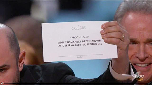
Anyone who watched the Academy Awards live could tell something was wrong. Warren Beatty looked at the card, which supposedly held the winner for Best Picture. And then he looked again. He could clearly tell something was amiss, but he couldn’t put his finger on what.

Then he showed it to Faye Dunaway who took the fall on his behalf. She announced La La Land for Best Picture. As we know now, she was reading the Best Actress card, which had both Emma Stone and La La Land listed.

The winner was actually Moonlight—printed on a card hiding somewhere backstage.

UPDATE: Read our follow-up post, which fixes the design, here.

[Screenshot: via Reddit]

Of course, this was an operational SNAFU. The most important moment of the night was ruined because Beatty was given the wrong card. But it could have been easily avoided by good design, argues Redditor ShinyTile. And it’s true.

The winning cards at the Academy Awards are layer upon layer of bad typographic design. For one, the Oscars logo is the biggest thing on the card. Which would only make sense if the announcer were blindfolded, stuck in a trunk, and dropped onto one of many stages at many award shows, and he didn’t know which one until he opened the envelope.

VIDEO: HERE’S EVERYTHING WE LOVED (AND HATED) ABOUT THOSE MEMORABLE OSCARS

Right below “The Oscars,” the winner is listed centered and in quotes. This decision makes some sense. Positionally, to make a word center-aligned makes it obvious and important—like the title of a book. But why isn’t this winner big or in any way bolded? Why isn’t the type presented to be more important through its weight or size than all the names listed below it—even just for pure legibility under the stage lights?

Finally, the card’s category label is in fine print. Best Picture or Best Actress is barely visible—tiny, italicized, and of a finer weight. Of course, that doesn’t matter when everything goes right. But the role of design isn’t to be a solution for when things so often go right, but for when things so often go wrong—which is, as it happens, exactly what happened last night.

“Just make “Best Picture” and “Moonlight” in huge text. That’s it,” writes ShinyTile. Exactly. It’s really that simple.

UPDATE: One designer re-worked the card to solve this issue. Check out his simple, clever solution.

SOURCE: https://www.fastcodesign.com/3068535/this-simple-design-change-would-have-saved-the-oscars

NOTA AICEX: Cliccando QUI vedete come potrebbero modificarsi i cartoncini, evitando l’invisibile titolo in basso “Best Picture” e mettendolo bello grande in alto.


Ecco cosa stanno sbagliando Apple, Google, e Tesla

 3067277-poster-p-1-don-norman-gives-tough-love-to-apple-google-and-tesla

But that doesn’t mean Norman isn’t critical of the direction of Silicon Valley’s powerhouse companies often celebrated for merging technology and design. In a casual, stream-of-consciousness conversation with Co.Design, Norman dissected what’s wrong with Apple, Google, Microsoft, and, as a little bonus we pushed for, Tesla.

APPLE—FOCUSED ON AESTHETICS OVER FUNCTIONALITY

In 2015, Norman penned a scathing review of Apple’s design. We asked if he’d seen the company improve since then.

“I think Apple’s products have gotten worse, not better.

Continua a leggere “Ecco cosa stanno sbagliando Apple, Google, e Tesla”

Perchè la Relazione è importante anche nell’era “Mobile”

Customer Service Depends on Relationships Even in the Mobile Age

AICEX SUMMARY: Ai tuoi clienti può anche non interessare che diventiate amici!

People access the internet on mobile devices more often than desktop computers, and that trend started years ago. It’s also been well over a year since “mobilegeddon,” when Google updated its algorithms to penalize websites without mobile counterparts.

With so many websites shifting to responsive design, consumers now turn to the mobile web and apps to address online shopping needs. Early adopters make purchases directly from their smartphones. Others use mobile devices to quickly look up items, consume product-specific content and discuss options with peers — any time, anywhere.

The mobile browsing experience is remarkably different from surfing via desktop, and it’s about much more than screen size. It’s about immediacy and creating “micro moments” along the journey to purchase. A recent study shows that 63 percent of adults in the United States use their mobile devices several times in a given month to obtain customer support. Ninety percent of them reported poor experiences when interacting with customer support via mobile.

To maximize sales, customer satisfaction, repeat business and referrals, you must master the art of customer service for mobile. Here are three mobile realities to keep in mind, along with a few tips to help you handle them.

Continua a leggere “Perchè la Relazione è importante anche nell’era “Mobile””

UX e Strategia

 AICEX_Quadrato_Bianco

AICEX: Un post con temi ancora Super attuali

By Kyra Friedell

Recently I went to the UX Roles and Titles: What do they mean? panel hosted by IxDA TC (Interaction Design Association, Twin Cities). Panelists’ titles ranged from UX Designer to VP of Experience and Engagement. While some distinguished their role as largely visual by nature others described their position as research and strategy-heavy. I was intrigued by the unspoken interplay of User Experience versus Strategy.

Before I dive into the relationship between strategy and UX, an understanding and definition of how UX and Strategy fit together seems necessary.
I’ve spent an unreasonable amount of time engrossed in debates over the rhetoric used around UX and Strategy, however at the core I believe:

Continua a leggere “UX e Strategia”