AICEX è il riferimento per la CX in Italia. Contribuisce al successo dei progetti CX, svolge attività di formazione, identifica le tecnologie migliori, diffonde la cultura della Customer Experience.
La tecnologia è in grado di cambiare il nostro modo di vivere, di pensare, e di essere. Siamo pronti ad accettarlo?
Tech is more important than ever, deeply affecting culture, politics and society. Given all the time we spend with our gadgets and apps, it’s essential to understand the principles that determine how tech affects our lives.
Understanding technology today
Technology isn’t an industry, it’s a method of transforming the culture and economics of existing systems and institutions. That can be a little bit hard to understand if we only judge tech as a set of consumer products that we purchase. But tech goes a lot deeper than the phones in our hands, and we must understand some fundamental shifts in society if we’re going to make good decisions about the way tech companies shape our lives—and especially if we want to influence the people who actually make technology.
Even those of us who have been deeply immersed in the tech world for a long time can miss the driving forces that shape its impact. So here, we’ll identify some key principles that can help us understand technology’s place in culture.
AICEX: la centralità delle persone si sposa più con il design, l’usabilità, gli spazi fisici e il buon senso piuttosto che con algoritmi e robot. Ecco perchè l’intelligenza artificiale sarà vincente solo se utilizzata a servizio delle persone.
Innovation might be the buzzword on everyone’s lips but customer and design centricity is what will win the day with customers according to Gartner.
Part of it is getting more return on investment (ROI) from their research and development dollars claimed Brian Prentice, vice president, research, Gartner.
“Organisations that are more design centric appear to be more innovative than the R&D dollars they spend. Apple for example, spends a fraction of R&D compared to Samsung, but their market capitalisation is higher and they seem to have a higher degree of customer satisfaction and loyalty than Samsung does,” said Prentice. Continua a leggere “La centralità del cliente vince sull’innovazione”→
AICEX: Un simpatico invito ad essere semplici, efficaci, efficienti, memorabili, … umani!
The experience, gushes the hotel website, will be delightful, with staff who will be your new best friends; luxuries beyond the dreams of Caligula. Just look at this shot of a couple lounging in bathrobes that are so fluffy they’ll have to sit on their suitcases when they steal them.
Yet it’s not really infinity pools, spas, and marble staircases that create a hotel experience.
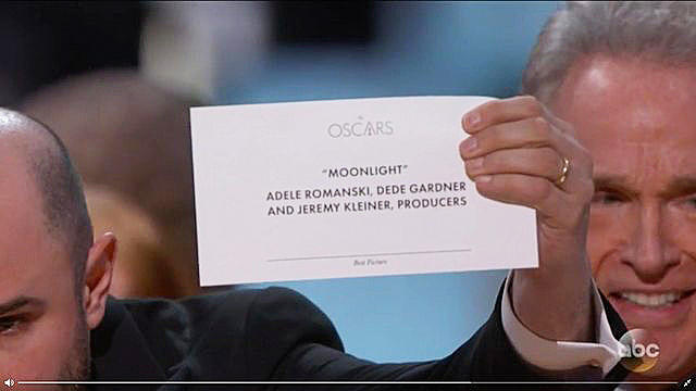
AICEX: Replichiamo un post pubblicato su fastcodesign.com secondo cui la figuraccia la notte degli Oscar è dovuta al fatto che i cartoncini dove sono scritti i vincitori non hanno un titolo adeguato. Alla fine di questo post trovate una proposta di modifica del cartoncino. Considerando Warren Beatty come un cliente una semplice Customer Journey o un banale test di User Experience avrebbe fatto emergere l’anomalia. O forse no? 🙂
Anyone who watched the Academy Awards live could tell something was wrong. Warren Beatty looked at the card, which supposedly held the winner for Best Picture. And then he looked again. He could clearly tell something was amiss, but he couldn’t put his finger on what.
Then he showed it to Faye Dunaway who took the fall on his behalf. She announced La La Land for Best Picture. As we know now, she was reading the Best Actress card, which had both Emma Stone and La La Land listed.
The winner was actually Moonlight—printed on a card hiding somewhere backstage.
UPDATE: Read our follow-up post, which fixes the design, here.
Of course, this was an operational SNAFU. The most important moment of the night was ruined because Beatty was given the wrong card. But it could have been easily avoided by good design, argues Redditor ShinyTile. And it’s true.
The winning cards at the Academy Awards are layer upon layer of bad typographic design. For one, the Oscars logo is the biggest thing on the card. Which would only make sense if the announcer were blindfolded, stuck in a trunk, and dropped onto one of many stages at many award shows, and he didn’t know which one until he opened the envelope.
Right below “The Oscars,” the winner is listed centered and in quotes. This decision makes some sense. Positionally, to make a word center-aligned makes it obvious and important—like the title of a book. But why isn’t this winner big or in any way bolded? Why isn’t the type presented to be more important through its weight or size than all the names listed below it—even just for pure legibility under the stage lights?
Finally, the card’s category label is in fine print. Best Picture or Best Actress is barely visible—tiny, italicized, and of a finer weight. Of course, that doesn’t matter when everything goes right. But the role of design isn’t to be a solution for when things so often go right, but for when things so often go wrong—which is, as it happens, exactly what happened last night.
“Just make “Best Picture” and “Moonlight” in huge text. That’s it,” writes ShinyTile. Exactly. It’s really that simple.
NOTA AICEX: Cliccando QUI vedete come potrebbero modificarsi i cartoncini, evitando l’invisibile titolo in basso “Best Picture” e mettendolo bello grande in alto.


Devi effettuare l'accesso per postare un commento.